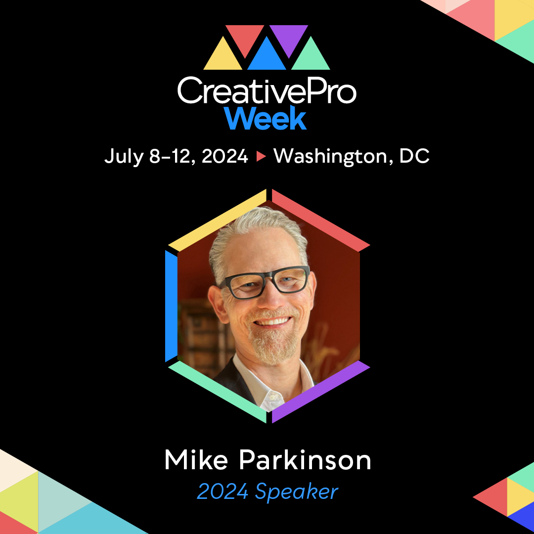
CreativePro Week July 8–12 Washington, DC (or attend online) Save $100 on multi-day passes with…

Article courtesy of Creato.
When developing a logo for your company, it can be tempting to just make it a picture that conveys your company name, or looks like the product you deal with most often—or to just put your company name in a good-looking font and call it a day. But there’s a whole suite of additional considerations that go into creating an effective logo.
Beyond the choice of whether to imitate traditional logos or go with something in line with modern logo design trends, there are a number of visual factors that actually create subconscious associations in the minds of the people who see them. It’s worth taking the time to consider what your logo tells your audience about you. After all, it may end up on the front of promotional t shirts of your staff in store, or at events or potentially worn by customers and fans.
Colour
Blue: Trust, dependability, strength. Used by ? of all brands—more than any other single colour.
Red: Action, energy. Eye-catching, and can provoke passion and intensity. May be interpreted as aggressive.
Yellow: Positivity and optimism, warmth and motivation. Attention-grabbing. Associated with the sun.
Green: Nature and serenity. Can imply health or wellness. Lighter shades suggest peace, while darker shades are associated with wealth and prestige.
Purple: Creativity or mystery. Historical association with royalty means purple can also imply sophistication.
Orange: Energy, confidence, friendliness. Can suggest a strong work ethic and productivity, or a sense of fun.
Pink: Suggests femininity. May convey excitement, youthfulness, and romance. Light shades may feel sentimental, while brighter shades suggest high energy.
Brown: Dependable and simple. May also be associated with nature or strength.
Black: Sophistication, luxury, and seduction. Gives an air of formality and authority.
Typography
Serif: Fonts with accents at the tips of letters. Suggest dependability, reputability, and trustworthiness. Because they’re designed to seem classical and traditional, they also feel more conventional than some others.
Sans serif: Fonts without accents at the end of letters. Have become widespread in the age of the Internet because of their readability, so they tend to make a logo seem fresh and contemporary, though they can also lend an air of establishment and straightforwardness.
Slab serif: Fonts with solid, rectangular accents. Can appear current and hip, and give a logo a bold, sturdy feeling.
Script: Look like handwriting or calligraphy. Imply artistry and grace, and may suggest femininity or formality.
Modern: Geometric and sharp. Highly distinctive, lending logos a crisp, trendy appearance.
Shape
Round shapes like circles, ovals, and ellipses are visually satisfying and tend to create positive emotions in viewers. Circles in particular bring a large number of unconscious associations—a circular logo can imply community, friendship, unity, or even love. In cultures that use wedding bands, a rings in a logo imply marriage or partnership, giving a sense of stability and endurance. Curved shapes in general are traditionally viewed as more soft and feminine in nature. Think about how easily it’s going to fit on promotional materials too, View all custom coasters for example.
Angular, straight-edged shapes like triangles and squares suggest practical or physical stability, and may be used to imply balance or structural integrity. Precise shapes with straight lines also suggest strength, professionalism, and efficiency, and triangles have subconscious associations with power, science, religion, and law. Since traditional gender roles ascribe many of these characteristics as masculine, companies whose products are biased toward a masculine audience often feature triangular elements.
Straight lines, whether vertical or horizontal, also have a number of implications and subconscious associations. Horizontal lines suggest tranquility, calm, and community, while vertical lines are more often associated with strength, aggression, and masculinity.
Conclusion
When creating your logo, there are many considerations beyond just whether to use an image, text, or both. Professional logo designers such as Logo Design UK, can help you to combine aesthetic and subconscious factors to create a logo that best captures—and communicates—the message you want to convey to your target market.
Related Posts