
We're looking forward to speaking at CreativePro Week, the essential how-to conference for anyone that…
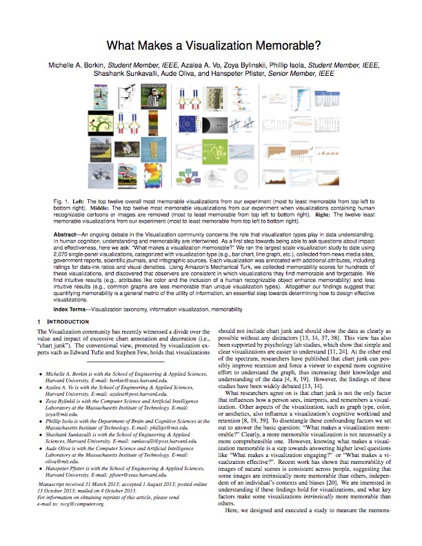
Michelle A. Borkin and her colleagues share their findings in her study to determine the role that visualization types play in data understanding. The team ran the largest scale visualization study to date using 2,070 single-panel visualizations, categorized with visualization type (e.g., bar chart, line graph, etc.), collected from news media sites, government reports, scientific journals, and infographic sources. Each visualization was annotated with additional attributes, including ratings for data-ink ratios and visual densities. Using Amazon’s Mechanical Turk, she collected memorability scores for hundreds of these visualizations, and discovered that observers are consistent in which visualizations they find memorable and forgettable. They found that intuitive results (e.g., attributes like color and the inclusion of a human recognizable object enhance memorability) and less intuitive results (e.g., common graphs are less memorable than unique visualization types). Download the study here.
Related Posts