This month, Mike Parkinson spoke about AI with GhostRanch Communications on their Presentation Thinking™ podcast.…
Business marketing is crucial in developing a large audience following and creating brand awareness for their product/s. There are many ways to market a business, whether you look for the Best SEO Tips online or go into social media marketing, they should all benefit in gaining more customers and therefore more profit. The best way to achieve this, however, is through a well-designed website and good marketing graphics. Even a well-designed letterhead from somewhere like https://kaizenprint.ie/letterheads/ won’t go amiss – it really is the little extra details that draw people in and set your business apart.
Reacting to what we see is instinctual. In some instances, our reactions can mean the difference between life and death. Fortunately for us, viewing a business’s proposals, presentations, websites, or marketing materials is not life-threatening, although it taps into similar feelings and reactions that then become judgments about what is being reviewed. Ultimately, this is why any business that is looking to create new marketing materials such as using a sticker printing company to provide company labels and adhesives, or and any other similar marketing effort that will contain graphics or striking visual elements, needs to be on their game and very careful about the styles they choose.
The style of your graphics says a lot about your solution and your company. Do you want to be seen as safe or innovative? Traditional or modern? Whether you like it or not, the look and feel of your proposals communicate these concepts at a glance. The key is to appear as you want to be seen. To elicit a targeted response based on the style you choose. You may want to translate that design into various other avenues related to your business, for example, Tatango SMS text messaging for companies can be a great way to keep in contact with customers, and specific graphics can be incorporated into that, making it more personal and appealing.
There are three prevailing design styles in modern business marketing design: skeuomorphism, flat, and material design. (For the purposes of the article, the following are broad definitions. There are nuances and subtleties within each style, which I do not address here.)
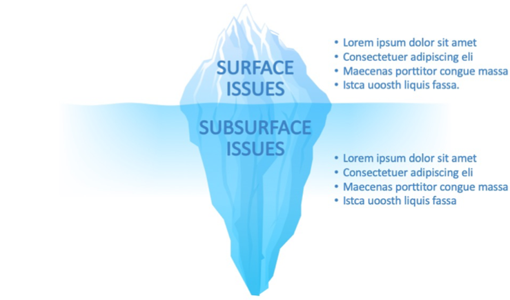
Skeuomorphism echoes reality. The designer’s intent is to use intuitive, familiar visual cues that help the audience recognize and understand the element depicted. It is sometimes used to trick the eye into making a design look and feel real. Examples of skeuomorphism include 3D elements, gradients, textures, drop shadows, bevels, and highlights. The following is an example of an iceberg graphic that I made in the skeumorphic design style.
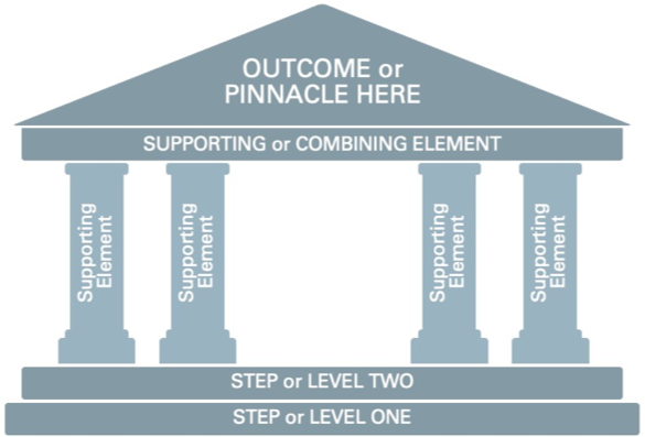
Flat design is the sometimes extreme simplification of all design elements. The designer intentionally removes unnecessary aesthetic enhancements (e.g., gradients, shadows, highlights). It is almost the opposite of skeuomorphism. The following is an example of a temple graphic I made in the flat design style.
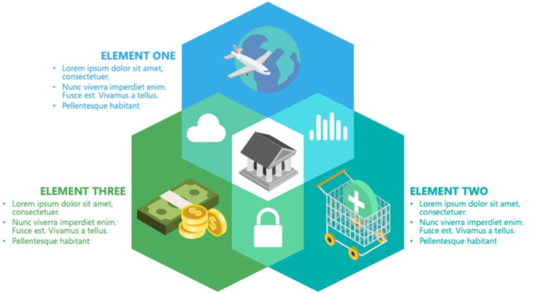
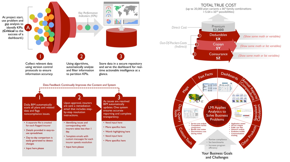
Material design is a hybrid of both skeuomorphic and flat design aesthetics. Material is the newest style of the three. It uses skeuomorphism, as needed, to communicate meaning, provide hierarchy, and add visual interest. Usually, the skeuomorphic elements are simplified to complement the flat features. The following is an example of a Venn graphic I designed in the material design style.
Which is better? All three have pros and cons. The subject matter, content, and medium play a role in which style works better. For example, if you are developing a basic user interface (UI), flat design usually loads faster.
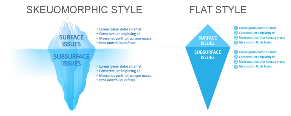
For business graphics, I recommend the material design style because it appeals to the broadest audience. Many times, your business materials are reviewed by a mixed group of potential clients with different preferences, biases, backgrounds, and ages; therefore, I use that latitude in material design to visually appeal to everyone in some way. Graphics that look real (skeuomorphic) often appeals to an older audience and simplified design (flat) appeals to a younger audience.Using extreme skeuomorphism, which looks hyperreal or is an overly embellished reality, is considered an outdated style.On the other hand,flat design can be seen as (too) easy to make and the associated content can be devalued. The audience may think, “This is a serious topic, and this graphic looks as if it was made in a few minutes. Are they taking this bid seriously? Is this the best I can expect from them?” The following two iceberg graphics compare two design styles: skeuomorphism versus flat. Which do you prefer and why?
When choosing a style, avoid your own bias. You are not the decision maker. You are not the person who chooses the winner. Instead, consider the style that is consistent with how you want your company and solution to be seen. If you know the customer well, then create graphics that will appeal to them.
With the material design, you want to avoid extremes. Balance the two styles and use the best of each. Below are four examples of graphics created in the material style. Notice the clean, simple, unembellished 3D coupled with flat design elements. (View more examples of graphics that combine both styles at Build-a-Graphic PowerPoint Add-In Billion Dollar Graphics.)
As you study your company’s brand and customer’s preferences, you will soon uncover the graphic style that best reflects both-and you will win more clients.

