This month, Mike Parkinson spoke about AI with GhostRanch Communications on their Presentation Thinking™ podcast.…
What makes a presentation bad? What makes a presentation amazing?
Presentations are a synergy between content and aesthetics. This post is primarily about presentation aesthetics. However, I’ll also address content-related issues. We’ll review six problems that can lead to bad presentations. Then you’ll uncover the solutions to transform them into amazing ones.
- Inconsistency
- Bullets
- Too Much Text
- No Reason to Care
- Lack of Originality
- Cognitive Dissonance
problem 1: inconsistency
Solution: Templates*
A template comprises layout, colors, fonts, brand standards, and graphic styles.
1. Create a PowerPoint template to define theme colors, layouts, and fonts.

2. Make a grid for consistency. I use the free add-in BrightSlide to add guides to my slides for margins, rows, columns, and units.
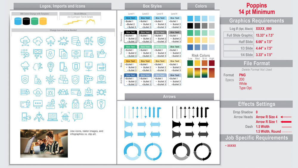
3. Assemble a slide style sheet for branding, logos, imports, icons, box styles, and colors. Include arrows, fonts, file formats, effects, table styles. In addition, I show graphic sizing, line styles, types of images, etc. Add newly designed icons and images to this slide cheat sheet.
4. Apply a consistent table design with Table Styles. First, go to the Table Design tab. Then scroll to find the table style that fits your template. Next, apply the style to your selected table. Format the text with your fonts and styles.
5. Use the accessibility checker to ensure your styles meet readability guidelines.
Learn the other five solutions on the CreativePro website.
*Do you want more information on templates?
Then check out these books on PowerPoint’s tools. Let PowerPoint MVPs show you their tips. You’ll become a template pro!
Microsoft PowerPoint Best Practices, Tips, and Techniques by Chantal Bossé
Building PowerPoint Templates v2 by Echo Swinford and Julie Terberg


