This month, Mike Parkinson spoke about AI with GhostRanch Communications on their Presentation Thinking™ podcast.…

Last week, I presented at the ATD International Conference and Exposition to a crowd of over 300 trainers and talent development professionals. Talk about a lot of pressure! They were excited to learn how to make infographics fast, and they took the challenge to create their own infographic at the end of the class.
Here’s an overview of my session for those who missed it:
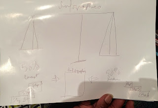
Graphics are known to communicate information faster, be more memorable, improve learning, and increase your likelihood of success. The process of creating infographics comprises 50% concepting and 50% rendering.
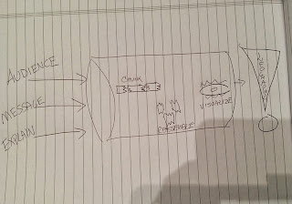
Before you render, you need to understand your concept. Write down your thoughts regarding these three main factors:
- Know your audience. You wouldn’t use the same images or text in an infographic intended for middle school students as you would for financial planners. An elearning presentation (like those seen on this source here) should look different from something in the business world. What graphic styles and images speak to your audience? What questions would they want answeDored about your concept?
- Know your message. What should your audience learn from your graphic? What is the benefit to your audience? Take a cue from Albert Einstein, “If you can’t explain it simply, you don’t understand it well enough.”
- Know how to explain or prove. Once you understand your message, then you need to prove it to the audience by providing metrics or explaining how your concept affects or benefits them.
After you’ve jotted down answers about your concept, then it is time to draw your concept.
- Chunk your concepts. Review what you’ve written. Highlight metrics, benefits, and anything that answers What? or How? Draw boxes around key points.
- Assemble your concepts. Review what you’ve highlighted. How can they be assembled to tell a story? How do they relate to each other? Can you assemble them into blocks that align like a pyramid or maybe steps in a process chart?
- Visualize your total concept. Review the boxes drawn around your metrics and benefits. Consider how they connect. If they create a process graphic, maybe a road or a bridge graphic may speak to your concept of a journey or transporting data. Visualize the icons that relate to the pieces comprising your idea. Use our Graphic Cheat Sheet to help you find the right graphic type for your concept.
Here are a few sites to help you find and create infographics:
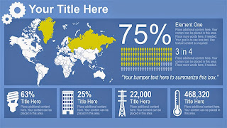
I showed the class several infographics for inspiration courtesy of Get My Graphic.
 |
| Infographic_0028 |
 |
| Infographic_0001 |
 |
| Infographic_0005 |
Practice makes better infographics, so I challenged the class to create an infographic based on what I’d taught them.
Here’s a sampling of the graphics rendered by the class. Quite impressive considering they had five minutes to create these:
Then one student went to the head of the class and completely rendered his graphic after the workshop. Thanks to Dan Gorgone, Instructional Designer at MarketingProfs, for this awesome infographic. He made this instructor very proud.
Also, thanks to Dan Steer who provided a great overview of the ATD conference and my workshop on his blog.
Lastly, thanks to everyone who attended Make Powerful Infographics Fast at ATD and made it a fun, engaging session. I hope to see you next year!
For information on my graphics training click here. To learn more about the graphic process I teach, you can find my book, Do-It-Yourself Billion Dollar Graphics, on Amazon.


