
Graphic Description
Use this Table graphic to correlate data along multiple axes. This Table graphic uses red, yellow, and green to show risk levels.

Use this Table graphic to correlate data along multiple axes. This Table graphic uses red, yellow, and green to show risk levels.

Use this Bar Chart to show amounts, values, and time.
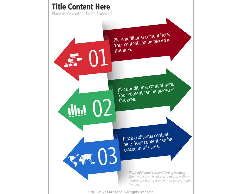
Use these Icons in Infographics or other graphic types to dynamically show movement and transition to a future state.
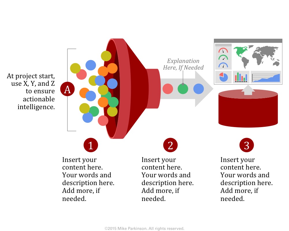
Use this Funnel Graphic as a metaphor showing the passing of elements through a conduit (the funnel) resulting in the…
Use this Infographic to share quantitative data related to a specific topic.