Gauge Graphic 2
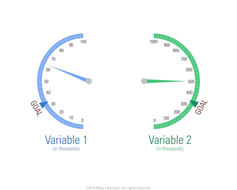
Use this Gauge Graphic to present data in a unique and professional way.
Use this Gauge Graphic to present data in a unique and professional way.
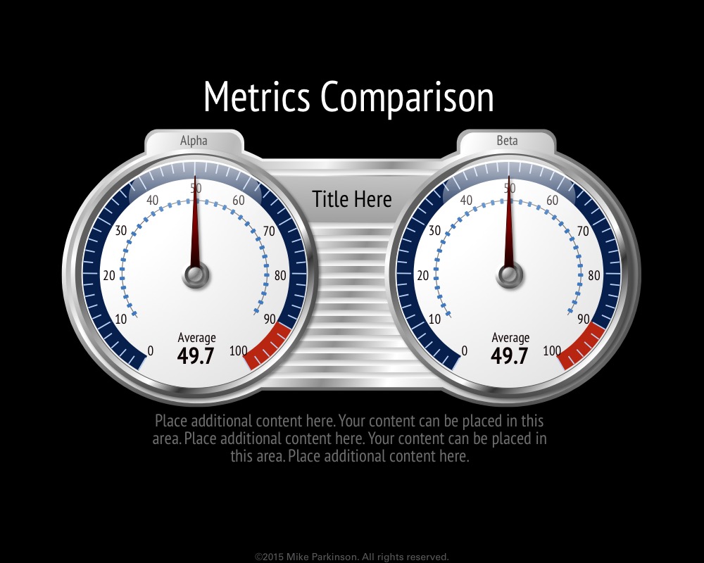
Use this Gauge Graphic to present data in a unique and professional way.
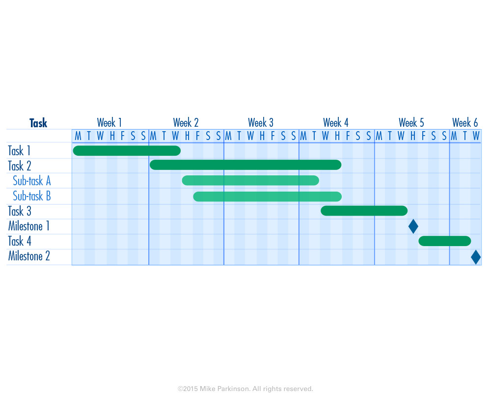
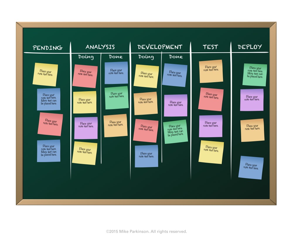
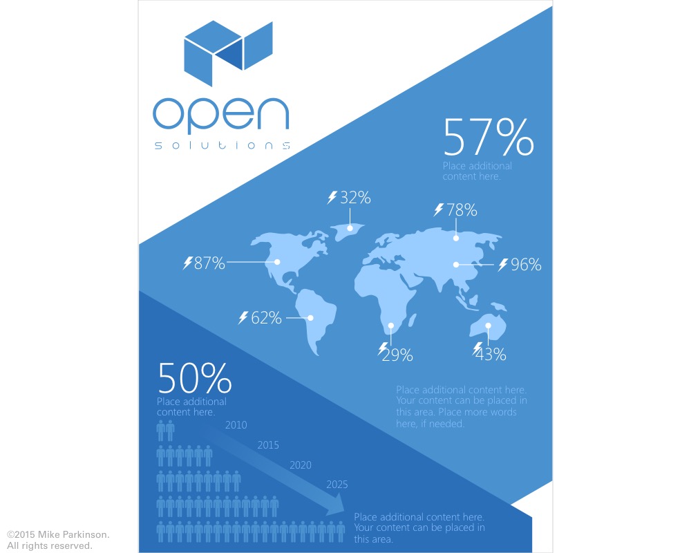
Use this Gantt Chart to communicate schedule and activity for tracking, planning, review purposes. (This chart is NOT data driven.)

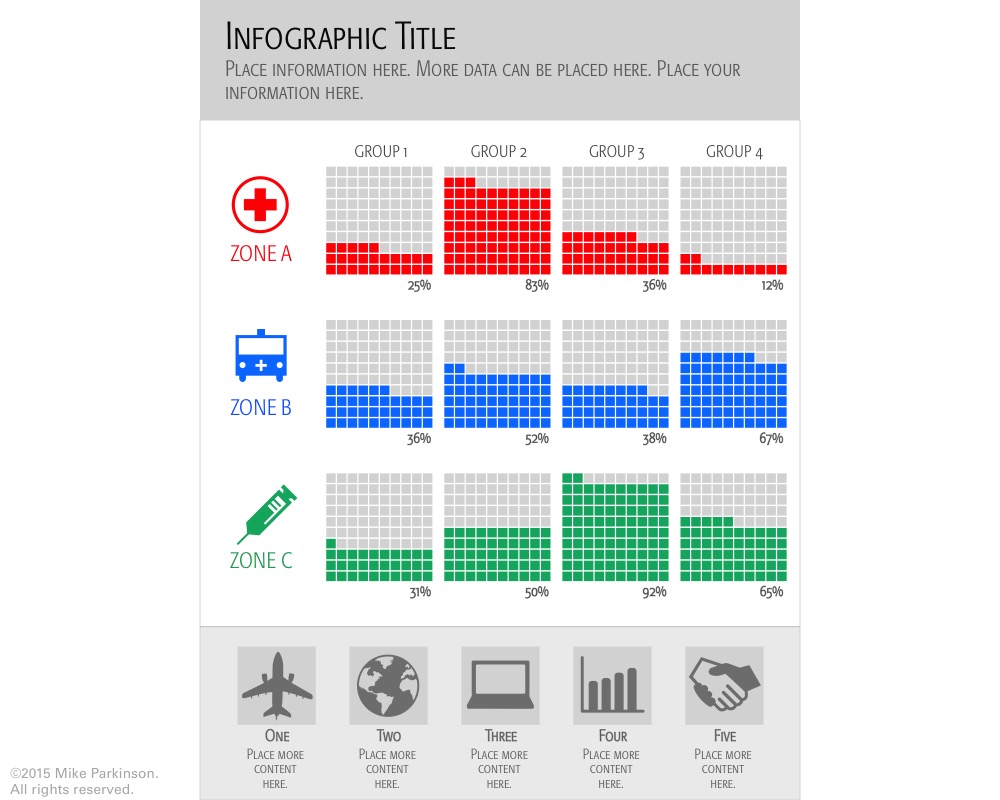
Use this Table graphic to correlate data along multiple axes. This Table graphic uses red, yellow, and green to show…
Use this Table to correlate data along multiple axes.
Use this Table to correlate data along multiple axes.
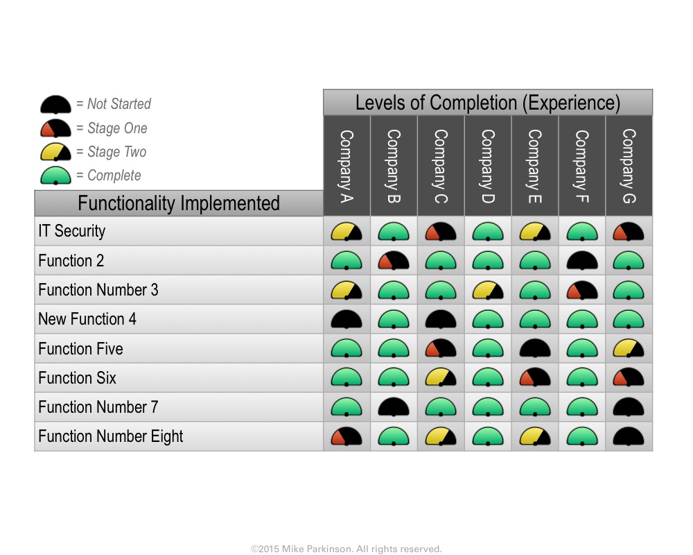
Use this Table to correlate data along multiple axes.
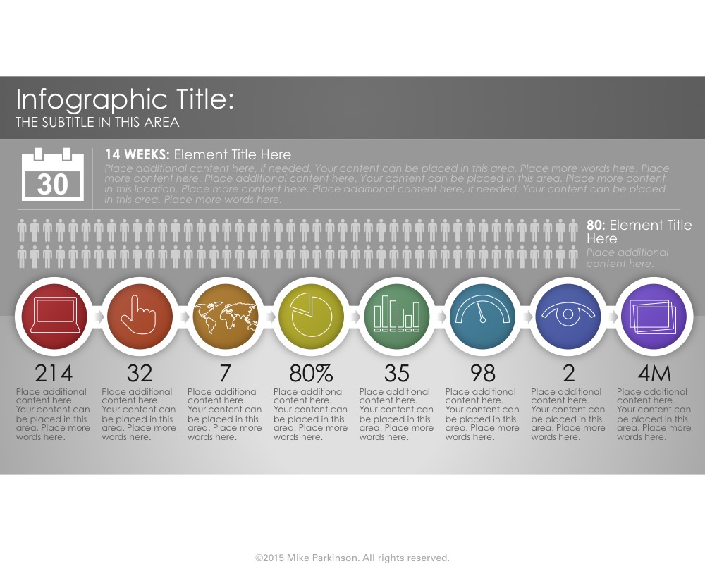
Use this Infographic to showcase interconnected information related to a specific topic.
Use this Infographic to showcase interconnected information related to a specific topic.
Use this Infographic to showcase interconnected information related to a specific topic.
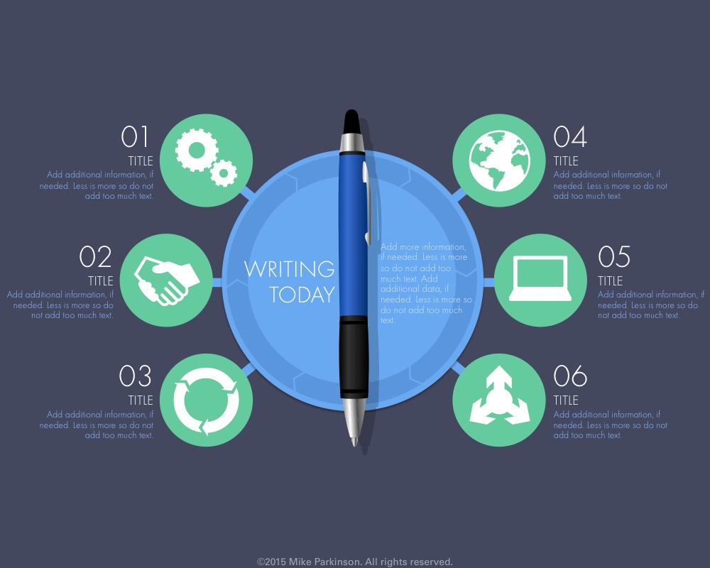
Use this Infographic to showcase interconnected information related to a specific topic.

Use this Infographic to showcase interconnected information related to a specific topic.